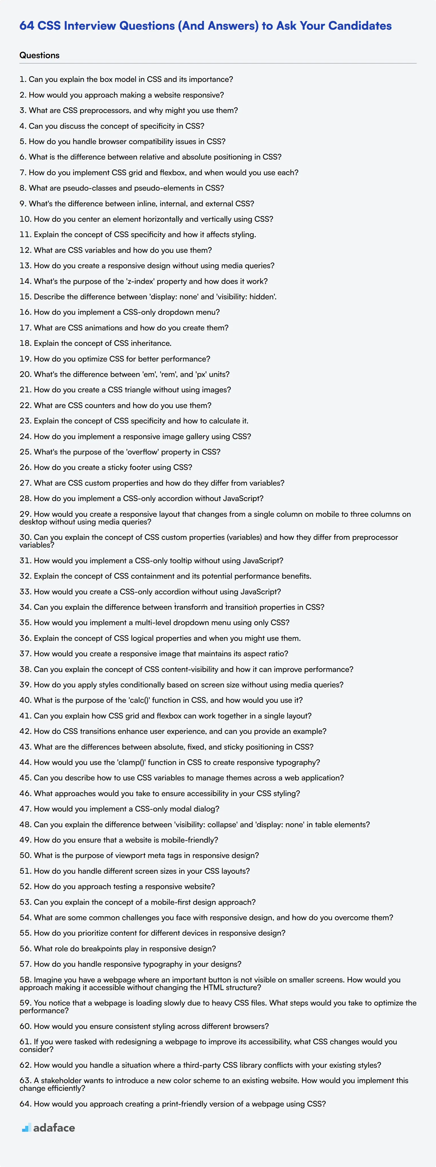
Interviewing for CSS skills can be daunting, especially when differentiating between junior, intermediate, and expert levels. To help streamline your process, we've put together some focused questions that will enable you to evaluate candidates effectively, complemented by our insights on the skills required for a front-end developer.
In this blog post, you will find curated questions across various skill levels, from basic to advanced styling concepts and responsive design queries. Each section is designed to help you pinpoint the competencies necessary for different developer tiers easily.
Using these questions, you can efficiently identify the right talent tailored for your team's needs. For a more comprehensive evaluation, consider implementing our HTML and CSS online test as a pre-interview screening tool.
Table of contents
Top 8 CSS questions to ask in interviews
To pinpoint candidates with a solid grasp of CSS fundamentals and practical experience, ask them these top 8 CSS interview questions. These questions are designed to help you evaluate whether applicants possess the right knowledge and problem-solving skills for your team.
1. Can you explain the box model in CSS and its importance?
The box model in CSS is a core concept that describes the rectangular boxes generated for elements in a document tree. Each box consists of four parts: content, padding, border, and margin.
Content is the innermost part where text and images appear. Padding is the space between the content and the border. Borders wrap around the padding and content, and margins are the outermost space, separating the element from other elements.
Strong candidates should highlight the importance of the box model in controlling layout and spacing. Look for candidates who can articulate how manipulating these four properties can affect the overall design and user experience.
2. How would you approach making a website responsive?
To make a website responsive, I would use a combination of flexible grids, flexible images, and CSS media queries. Flexible grids allow the layout to adapt to different screen sizes, while flexible images ensure that media scales properly.
CSS media queries enable me to apply different styles based on the device's characteristics, such as width, height, and orientation. By doing so, I can ensure the website looks good and functions well across various devices.
An ideal candidate should demonstrate familiarity with concepts like viewport meta tags and the use of frameworks like Bootstrap. They should also stress the importance of testing across multiple devices.
3. What are CSS preprocessors, and why might you use them?
CSS preprocessors like SASS and LESS are scripting languages that extend CSS by adding features like variables, nesting, and functions. They help in writing more maintainable and reusable code.
Using a preprocessor allows for more efficient and organized styling workflows. Variables can store values used throughout the stylesheet, and nesting enables a cleaner hierarchical structure, making the CSS easier to read and manage.
Look for candidates who can provide practical examples of how preprocessors have improved their workflow. An ideal response will include specific features they find beneficial and how these features have solved real-world problems.
4. Can you discuss the concept of specificity in CSS?
Specificity in CSS determines which styles are applied to an element when there are conflicting rules. It is calculated based on the types of selectors used: inline styles, IDs, classes, attributes, and pseudo-classes, and element selectors.
Specificity is crucial for resolving conflicts and ensuring that the most appropriate styles are applied. For example, an ID selector has higher specificity than a class selector, which in turn has higher specificity than an element selector.
Candidates should demonstrate an understanding of how to calculate specificity and apply this knowledge to avoid common pitfalls, such as unintended style overrides. An ideal response should also touch on the importance of maintaining a clear and manageable stylesheet.
5. How do you handle browser compatibility issues in CSS?
Handling browser compatibility issues involves using a mix of techniques such as CSS resets, vendor prefixes, and feature detection. CSS resets help ensure a consistent baseline across browsers, while vendor prefixes enable the use of experimental features.
Feature detection tools like Modernizr can be used to apply specific styles based on whether the browser supports a particular CSS property. Additionally, testing across multiple browsers and using fallback styles ensures broader compatibility.
An ideal candidate should mention the importance of thorough testing and staying updated with browser-specific quirks. Look for examples of how they've managed cross-browser compatibility in past projects.
6. What is the difference between relative and absolute positioning in CSS?
Relative and absolute positioning in CSS define how elements are placed on a webpage. Relative positioning positions an element relative to its normal position, allowing it to be offset without affecting other elements.
Absolute positioning, on the other hand, positions an element relative to its nearest positioned ancestor or the initial containing block if no ancestor is positioned. This removes the element from the normal document flow, allowing for precise placement.
Candidates should provide clear examples of when and why they would use each positioning type. An ideal response will include scenarios where each type is beneficial, demonstrating their practical understanding of these concepts.
7. How do you implement CSS grid and flexbox, and when would you use each?
CSS Grid and Flexbox are both layout systems that help in creating complex web layouts. CSS Grid is ideal for creating two-dimensional layouts, allowing control over both rows and columns.
Flexbox, on the other hand, is designed for one-dimensional layouts, making it perfect for aligning items along a single axis, either horizontally or vertically.
Candidates should explain that Grid is used for more complex, nested layouts, while Flexbox is suited for simpler, single-axis alignments. Look for candidates who can discuss the strengths and weaknesses of each and provide examples of their usage in real projects.
8. What are pseudo-classes and pseudo-elements in CSS?
Pseudo-classes are used to define a special state of an element, such as :hover, :focus, or :nth-child. They allow you to style elements based on user interaction or their position in the DOM.
Pseudo-elements are used to style specific parts of an element, such as ::before and ::after, which insert content before or after the element's actual content.
An ideal candidate should provide examples of how they’ve used pseudo-classes and pseudo-elements to enhance user experience and design. Look for explanations that show a deep understanding of these tools and their practical applications.
20 CSS interview questions to ask junior developers
To assess the CSS proficiency of junior front-end developers, use these 20 interview questions. They cover essential concepts and practical applications, helping you identify candidates with a solid foundation in CSS and its best practices.
- What's the difference between inline, internal, and external CSS?
- How do you center an element horizontally and vertically using CSS?
- Explain the concept of CSS specificity and how it affects styling.
- What are CSS variables and how do you use them?
- How do you create a responsive design without using media queries?
- What's the purpose of the 'z-index' property and how does it work?
- Describe the difference between 'display: none' and 'visibility: hidden'.
- How do you implement a CSS-only dropdown menu?
- What are CSS animations and how do you create them?
- Explain the concept of CSS inheritance.
- How do you optimize CSS for better performance?
- What's the difference between 'em', 'rem', and 'px' units?
- How do you create a CSS triangle without using images?
- What are CSS counters and how do you use them?
- Explain the concept of CSS specificity and how to calculate it.
- How do you implement a responsive image gallery using CSS?
- What's the purpose of the 'overflow' property in CSS?
- How do you create a sticky footer using CSS?
- What are CSS custom properties and how do they differ from variables?
- How do you implement a CSS-only accordion without JavaScript?
10 intermediate CSS interview questions and answers to ask mid-tier developers
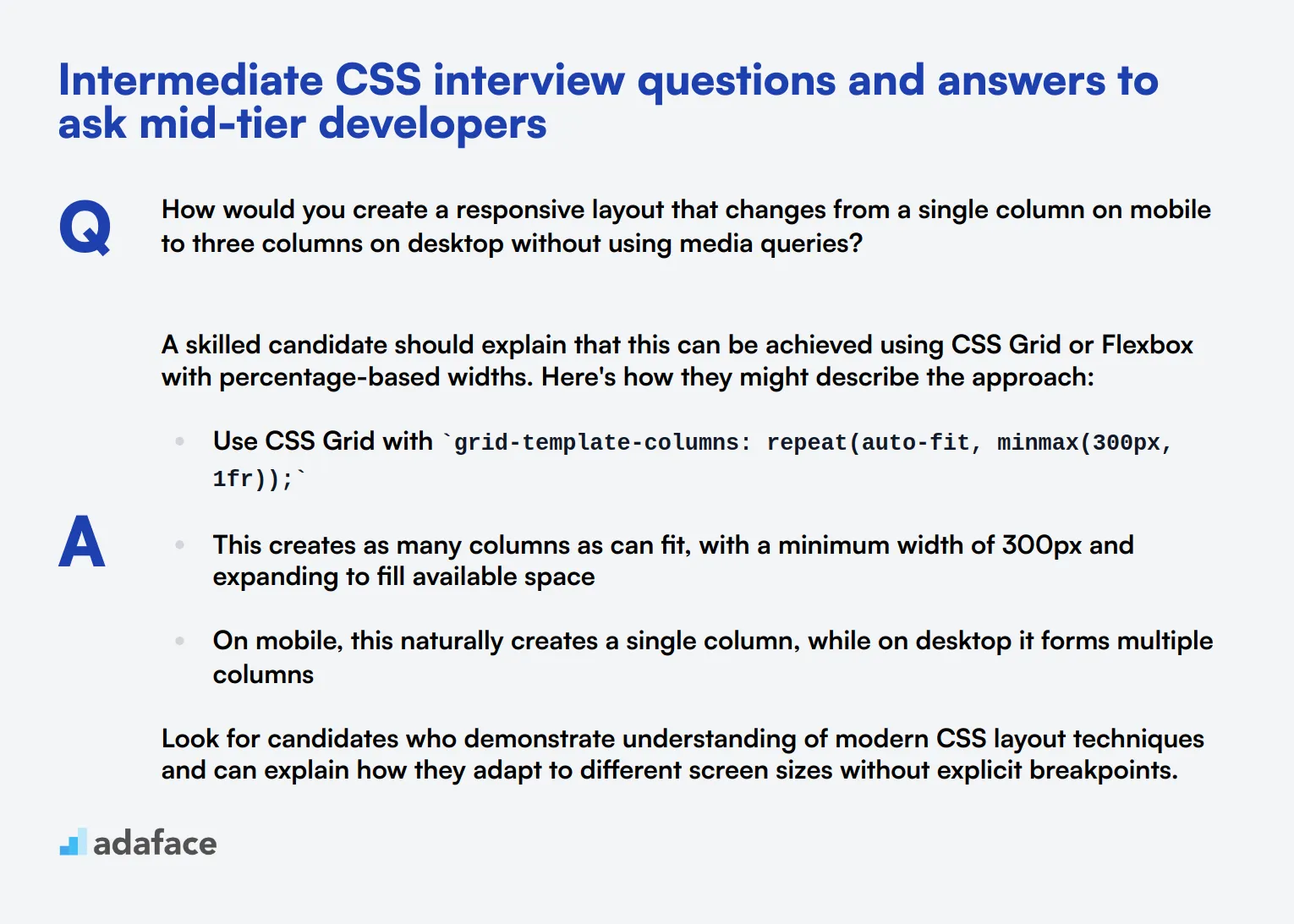
Ready to separate the CSS wizards from the apprentices? These 10 intermediate CSS interview questions are designed to help you identify mid-tier developers who can bring your web projects to life. Use these questions to gauge a candidate's understanding of more advanced CSS concepts and their ability to implement creative solutions in real-world scenarios.
1. How would you create a responsive layout that changes from a single column on mobile to three columns on desktop without using media queries?
A skilled candidate should explain that this can be achieved using CSS Grid or Flexbox with percentage-based widths. Here's how they might describe the approach:
- Use CSS Grid with
grid-template-columns: repeat(auto-fit, minmax(300px, 1fr));
- This creates as many columns as can fit, with a minimum width of 300px and expanding to fill available space
- On mobile, this naturally creates a single column, while on desktop it forms multiple columns
Look for candidates who demonstrate understanding of modern CSS layout techniques and can explain how they adapt to different screen sizes without explicit breakpoints.
2. Can you explain the concept of CSS custom properties (variables) and how they differ from preprocessor variables?
A strong answer should cover the following points:
- CSS custom properties are native to CSS and don't require compilation
- They can be updated dynamically with JavaScript
- They cascade and inherit, following the normal CSS cascade rules
- They can be scoped to specific elements or used globally
- Preprocessor variables are static and determined at compile-time
Ideal candidates will also mention use cases, such as theming or responsive design, showcasing their practical understanding of this feature.
3. How would you implement a CSS-only tooltip without using JavaScript?
A competent candidate should describe a solution using pseudo-elements and the :hover pseudo-class. Key points to look for:
- Use
data-attributes to store the tooltip text
- Create a pseudo-element (like
::after) to display the tooltip
- Position the pseudo-element absolutely relative to its parent
- Use the
:hoverpseudo-class to show/hide the tooltip
- Apply transitions for smooth appearance/disappearance
Candidates who mention accessibility considerations, such as ensuring the tooltip is readable and doesn't obscure other content, demonstrate a more comprehensive understanding of front-end development.
4. Explain the concept of CSS containment and its potential performance benefits.
A knowledgeable candidate should explain CSS containment as follows:
- CSS containment allows developers to isolate parts of the page, informing the browser that an element's contents are independent of the rest of the page
- It's implemented using the
containproperty with values likelayout,paint,size, orcontent
- Performance benefits include:
- Reduced style recalculation times
- Improved paint performance
- Optimized rendering for off-screen content
Look for candidates who can provide examples of when to use containment, such as in long scrollable lists or complex widget areas, showing they understand its practical applications.
5. How would you create a CSS-only accordion without using JavaScript?
An adept candidate should describe a solution using the :target pseudo-class or checkbox hack. Key points to cover:
- Structure HTML with labels and hidden checkboxes (for checkbox method) or links and IDs (for :target method)
- Use CSS to hide/show content based on checkbox state or target
- Implement smooth transitions for opening/closing panels
- Ensure the solution is keyboard accessible
Candidates who discuss the pros and cons of each method, or mention considerations for screen readers, demonstrate a deeper understanding of CSS techniques and accessibility.
6. Can you explain the difference between `transform` and `transition` properties in CSS?
transform and transition are distinct properties with different purposes:
transformmodifies the appearance of an element (e.g., scale, rotate, skew, translate)
transitiondefines how changes in CSS properties should occur over time, creating smooth animations
A strong candidate will provide examples:
transform: scale(1.5)immediately enlarges an element by 50%
transition: all 0.3s easemakes any property change occur over 0.3 seconds
Look for explanations of how these properties can work together to create engaging user interfaces and smooth animations.
7. How would you implement a multi-level dropdown menu using only CSS?
A proficient candidate should describe a solution using nested lists and the :hover pseudo-class. Key points to cover:
- Structure the menu using nested
<ul>elements
- Use
display: noneto hide submenus initially
- Apply
display: blockon:hoverto show submenus
- Use
position: absolutefor submenus to layer them correctly
- Implement a small delay using
transition-delayto prevent accidental closing
Candidates who mention accessibility concerns, such as keyboard navigation or touch device considerations, demonstrate a more comprehensive understanding of web development.
8. Explain the concept of CSS logical properties and when you might use them.
A knowledgeable candidate should explain CSS logical properties as follows:
- Logical properties are writing-mode independent alternatives to physical properties
- They adapt to changes in text direction and writing mode
- Examples include
margin-inline-startinstead ofmargin-left, orborder-block-endinstead ofborder-bottom
Use cases to look for:
- Multilingual websites supporting both LTR and RTL languages
- Layouts that need to adapt to vertical writing modes
Candidates who can discuss the benefits in terms of code maintainability and internationalization show a deeper understanding of modern CSS practices.
9. How would you create a responsive image that maintains its aspect ratio?
A competent candidate should describe multiple approaches:
- Using
aspect-ratioproperty:
- Set
width: 100%andaspect-ratio: 16 / 9(or appropriate ratio)
- Using percentage padding trick:
- Wrap image in a container with
padding-topset to a percentage
- Position the image absolutely within this container
- Using
object-fit: coveron the image itself
Look for candidates who can explain the pros and cons of each method, such as browser support considerations or behavior with different image sizes. Those who mention the importance of providing appropriate sized images for different devices demonstrate a holistic understanding of responsive design.
10. Can you explain the concept of CSS content-visibility and how it can improve performance?
content-visibility is a CSS property that allows the browser to skip rendering of off-screen content, potentially improving page load times and scrolling performance.
Key points a strong candidate should cover:
- It can be set to
auto,hidden, orvisible
- When set to
auto, the browser will only render the content when it's needed (i.e., when it's about to become visible)
- It's particularly useful for long pages with complex content
- It should be used in conjunction with
contain-intrinsic-sizeto prevent layout shifts
Look for candidates who can discuss potential drawbacks, such as impact on find-in-page functionality, and how to mitigate them. This demonstrates a nuanced understanding of modern CSS performance techniques.
10 CSS questions related to styling concepts
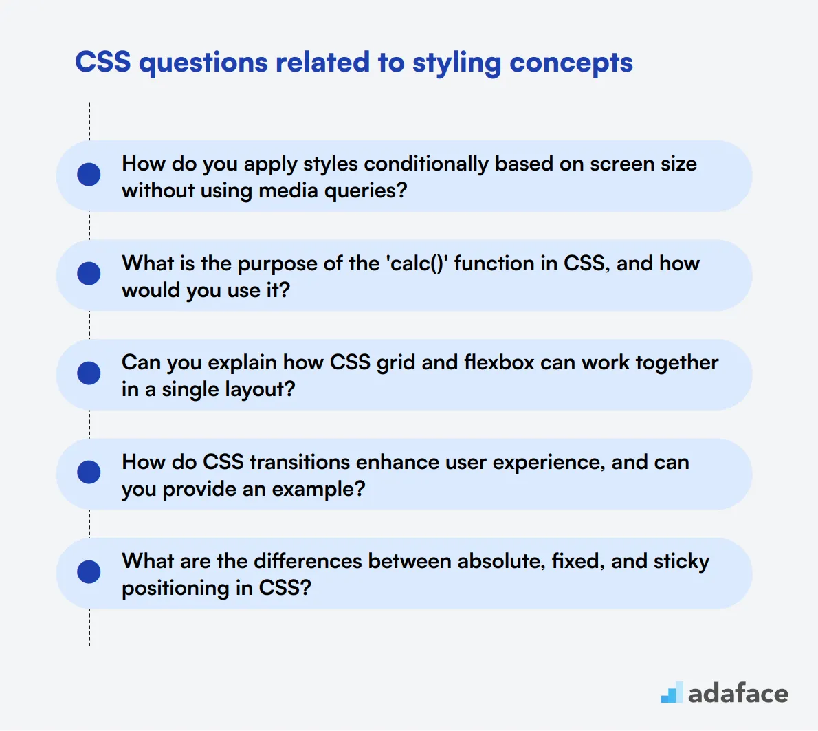
To evaluate a candidate's grasp of essential CSS styling concepts, incorporate these targeted questions into your interview process. These inquiries will help reveal their practical knowledge and problem-solving abilities, ensuring they align with your team's needs. For more insights on necessary skills, check out our front-end developer job description.
- How do you apply styles conditionally based on screen size without using media queries?
- What is the purpose of the 'calc()' function in CSS, and how would you use it?
- Can you explain how CSS grid and flexbox can work together in a single layout?
- How do CSS transitions enhance user experience, and can you provide an example?
- What are the differences between absolute, fixed, and sticky positioning in CSS?
- How would you use the 'clamp()' function in CSS to create responsive typography?
- Can you describe how to use CSS variables to manage themes across a web application?
- What approaches would you take to ensure accessibility in your CSS styling?
- How would you implement a CSS-only modal dialog?
- Can you explain the difference between 'visibility: collapse' and 'display: none' in table elements?
9 CSS interview questions and answers related to responsive design
To assess whether your candidates have a solid grasp of responsive design principles in CSS, ask them these insightful questions. This list will help you determine if they can create adaptable, user-friendly websites that look great on any device.
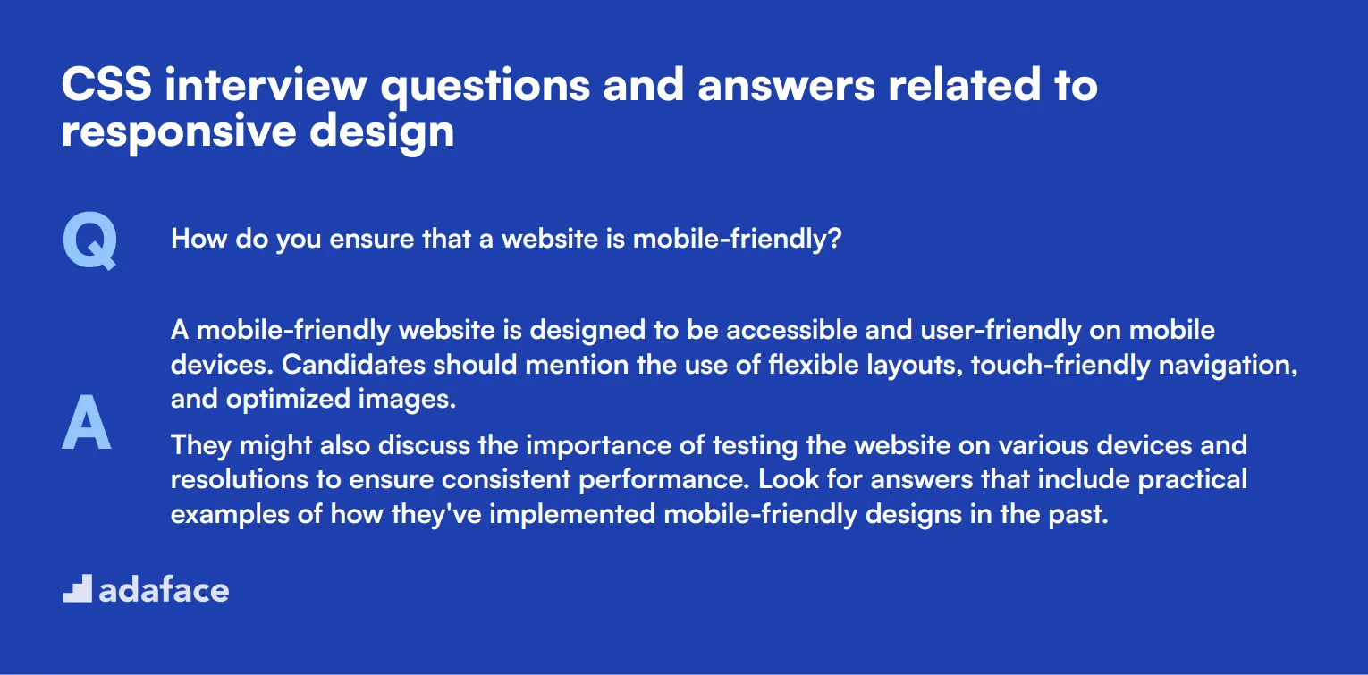
1. How do you ensure that a website is mobile-friendly?
A mobile-friendly website is designed to be accessible and user-friendly on mobile devices. Candidates should mention the use of flexible layouts, touch-friendly navigation, and optimized images.
They might also discuss the importance of testing the website on various devices and resolutions to ensure consistent performance. Look for answers that include practical examples of how they've implemented mobile-friendly designs in the past.
2. What is the purpose of viewport meta tags in responsive design?
The viewport meta tag is essential for controlling the layout on mobile browsers. It helps to set the width of the viewport to match the device's width, ensuring that the content scales correctly on different screen sizes.
A strong candidate will explain that without the viewport meta tag, web pages might not render correctly on mobile devices, leading to poor user experiences. They should demonstrate an understanding of how to use viewport meta tags effectively.
3. How do you handle different screen sizes in your CSS layouts?
Handling different screen sizes involves creating flexible layouts that can adapt to various devices. Candidates should mention using relative units like percentages and ems instead of fixed pixels, along with techniques like fluid grids and flexible images.
They might also discuss the importance of media queries in tailoring the CSS to different devices. Look for candidates who can provide specific examples of how they've adapted layouts for different screen sizes in previous projects.
4. How do you approach testing a responsive website?
Testing a responsive website involves checking its performance on various devices and browsers. Candidates should talk about using tools like browser developer tools to simulate different screen sizes and devices.
They might also mention using real devices for testing and leveraging online services that offer cross-browser testing. Strong candidates will provide a detailed approach to ensure comprehensive testing for responsive design.
5. Can you explain the concept of a mobile-first design approach?
A mobile-first design approach starts with designing for the smallest screen sizes and then progressively enhancing the design for larger screens. This ensures that the website is optimized for mobile users first.
Candidates should explain that this approach leads to more efficient and user-friendly designs on mobile devices. Look for examples of how they have implemented mobile-first design principles in their past projects.
6. What are some common challenges you face with responsive design, and how do you overcome them?
Common challenges in responsive design include maintaining performance, ensuring cross-browser compatibility, and handling varying screen sizes. Candidates should discuss strategies for overcoming these challenges, like optimizing images and using polyfills for browser compatibility.
They might also mention using frameworks like Bootstrap to streamline responsive design. Look for candidates who can articulate specific challenges they've faced and how they've successfully addressed them.
7. How do you prioritize content for different devices in responsive design?
Prioritizing content for different devices involves ensuring that the most important information is easily accessible on all screen sizes. Candidates should mention techniques like progressive disclosure, where less critical content is hidden behind interactions on smaller screens.
They might also discuss using different layouts to highlight key content on various devices. Look for an understanding of user needs and how to effectively prioritize content to enhance user experience.
8. What role do breakpoints play in responsive design?
Breakpoints are specific points in the CSS where the design changes to accommodate different screen sizes. They help to ensure that the layout adapts smoothly across various devices.
Candidates should explain how to determine appropriate breakpoints based on the design's content and layout. Look for an understanding of how to use breakpoints effectively to create seamless transitions between different screen sizes.
9. How do you handle responsive typography in your designs?
Responsive typography involves adjusting font sizes and line heights to ensure readability across different devices. Candidates should discuss using relative units like ems and rems and employing CSS media queries to fine-tune typography.
They might also mention using scalable units and fluid typography techniques to create a harmonious reading experience. Look for practical examples of how they have implemented responsive typography in their projects.
7 situational CSS interview questions with answers for hiring top developers
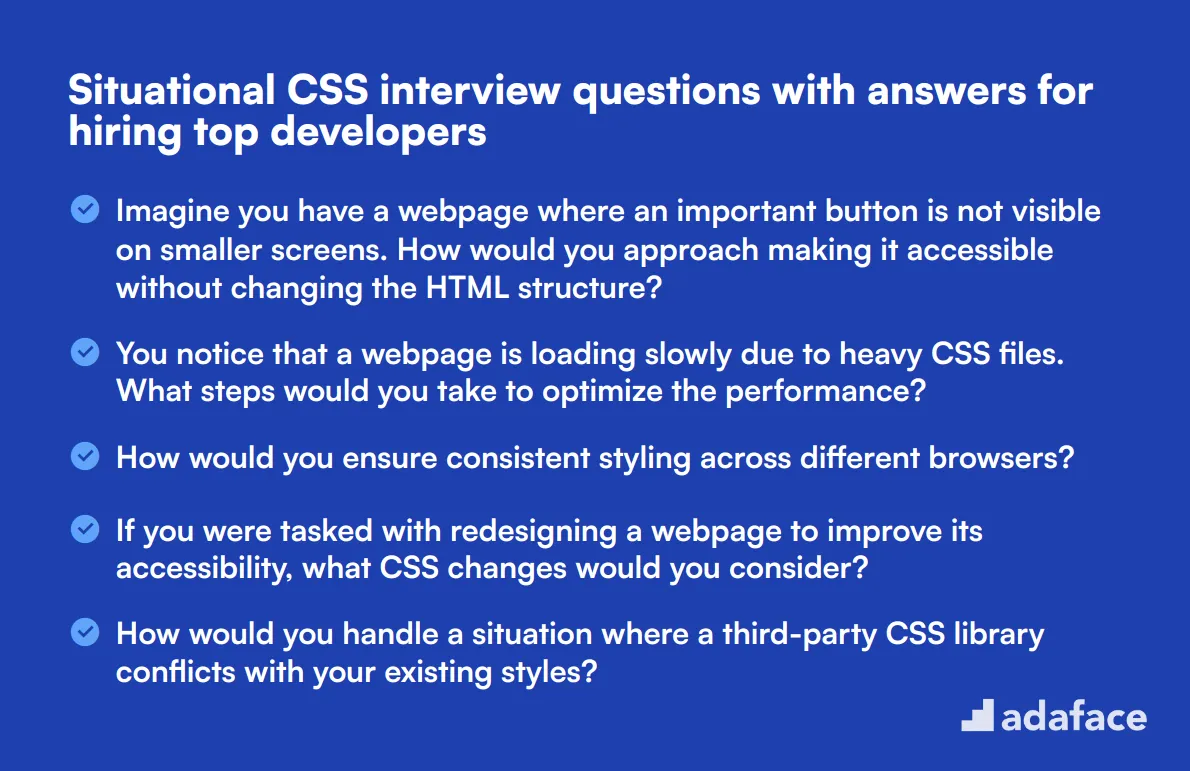
To identify if applicants possess the practical skills to address real-world CSS challenges, ask them these situational CSS interview questions. This will help you uncover their problem-solving abilities and how well they can translate theory into practice.
1. Imagine you have a webpage where an important button is not visible on smaller screens. How would you approach making it accessible without changing the HTML structure?
A strong candidate would start by discussing the importance of ensuring key elements are accessible on all screen sizes. They might suggest using CSS media queries to adjust the button's position or size, ensuring it remains visible and accessible.
Another approach could involve using relative positioning to move the button to a more accessible location or altering padding and margins. They might also consider using flexbox or grid to reorganize elements dynamically.
Look for candidates who demonstrate a deep understanding of responsive design principles and accessibility. They should emphasize the importance of user experience across different devices and screen sizes.
2. You notice that a webpage is loading slowly due to heavy CSS files. What steps would you take to optimize the performance?
Candidates should talk about various optimization techniques such as minifying CSS files to reduce their size, removing unused CSS rules, and combining multiple CSS files into one to reduce HTTP requests.
They might also mention the importance of using efficient CSS selectors and leveraging browser caching to improve load times and page performance.
An ideal response will highlight a proactive approach to performance optimization. Look for candidates who can articulate the benefits of each technique and have a solid understanding of performance best practices.
3. How would you ensure consistent styling across different browsers?
A good candidate would mention using CSS resets or normalizing stylesheets to create a consistent baseline across browsers. They might also discuss testing the website across multiple browsers and using vendor prefixes to ensure compatibility.
They could also talk about the importance of using modern CSS features while providing fallbacks for older browsers to maintain a consistent experience.
Look for candidates who show a thorough understanding of cross-browser compatibility issues and demonstrate a systematic approach to testing and troubleshooting.
4. If you were tasked with redesigning a webpage to improve its accessibility, what CSS changes would you consider?
Candidates might begin by discussing the importance of ensuring text is readable by using sufficient contrast between text and background colors. They could suggest using relative units like 'em' or 'rem' for font sizes to ensure scalability.
They might also mention enhancing focus indicators for interactive elements and ensuring that spacing and layout are flexible to accommodate different input methods.
Look for candidates who emphasize the importance of accessibility and demonstrate a comprehensive understanding of how CSS can be used to create inclusive and user-friendly designs.
5. How would you handle a situation where a third-party CSS library conflicts with your existing styles?
Candidates should talk about identifying and isolating the conflicting styles by inspecting the CSS rules applied to the affected elements. They might suggest using more specific selectors or leveraging scoped CSS to prevent conflicts.
They could also mention the importance of understanding the third-party library's structure and possibly overriding its styles with custom CSS while maintaining the library's functionality.
An ideal response will show that the candidate can effectively troubleshoot and resolve conflicts without compromising the overall design and functionality.
6. A stakeholder wants to introduce a new color scheme to an existing website. How would you implement this change efficiently?
A good candidate would start by discussing the use of CSS variables to define the new color scheme, allowing for easy updates throughout the stylesheet. They might also suggest creating a design system or style guide to maintain consistency.
They could mention the importance of testing the new color scheme for accessibility, ensuring sufficient contrast and readability across different devices and screen sizes.
Look for candidates who demonstrate strategic thinking and a methodical approach to implementing design changes, ensuring both efficiency and consistency.
7. How would you approach creating a print-friendly version of a webpage using CSS?
Candidates might discuss using CSS media queries specifically designed for print styles. They could suggest hiding non-essential elements, adjusting font sizes, and ensuring that the layout is optimized for paper.
They could also talk about setting up page breaks and ensuring that important content is not cut off between pages.
Look for candidates who understand the nuances of print styling and can articulate the steps needed to create a user-friendly print version of a webpage.
Which CSS skills should you evaluate during the interview phase?
While it's challenging to assess every aspect of a candidate's capabilities in a single interview, focusing on key CSS skills can provide a strong indicator of their proficiency and suitability for the role. Here are some core CSS skills to evaluate during the interview phase to ensure candidates meet the job requirements.
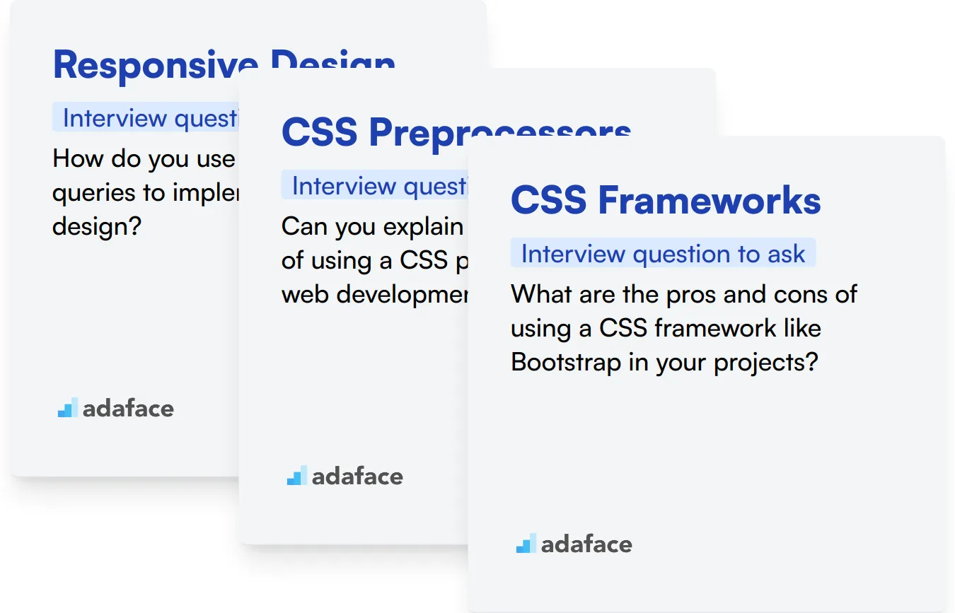
Responsive Design
Responsive design is fundamental as it ensures websites function well on a variety of devices and screen sizes. Mastery of this skill indicates a candidate's ability to create accessible and user-friendly websites.
To initially assess this skill, consider using a tailored assessment test that includes relevant MCQs. For a focused approach, the HTML/CSS online test from our library can be a great starting point.
During the interview, delve deeper by asking specific questions that challenge their understanding and application of responsive design principles.
How do you use CSS media queries to implement responsive design?
Listen for a clear explanation of media queries, breakpoints, and CSS units like ems or percentages. An adept candidate will often discuss their strategy for mobile-first design or progressive enhancement.
CSS Preprocessors
CSS preprocessors like SASS or LESS enhance CSS code's maintainability and readability. They show a developer's ability to utilize advanced tools for efficient styling.
To screen for this skill, you might want to use a specific assessment that includes MCQs on preprocessors. Unfortunately, we do not have a direct test in our library for this skill.
To assess familiarity with preprocessors, consider asking:
Can you explain the advantages of using a CSS preprocessor in web development?
Look for insights on variables, nesting, mixins, and better organization of CSS code, which are key benefits and show the candidate’s depth of understanding.
CSS Frameworks
Proficiency in CSS frameworks like Bootstrap or Tailwind is critical as they provide a basis for rapid, consistent styling across projects. This skill indicates how well a developer can adapt to existing environments and understand widespread industry practices.
Assessing knowledge of CSS frameworks can be efficiently done through a structured test encompassing essential MCQs. Consider using our Front-end developer test, which covers various frameworks.
In the interview, you can further explore their expertise by asking:
What are the pros and cons of using a CSS framework like Bootstrap in your projects?
Answers should reflect an understanding of the balance between rapid development and potential over-reliance on frameworks, impacting customizability and bloated code.
Hire top CSS candidates with Adaface
If you are looking to hire someone with CSS skills, you need to ensure they have those skills accurately.
The best way to do this would be to use skill tests. Consider using our HTML & CSS Online Test to assess their abilities.
Once you use this test, you can shortlist the best applicants and call them for interviews.
Ready to get started? Head over to our sign up page to begin.
JavaScript Online Test
Download CSS interview questions template in multiple formats
CSS Interview Questions FAQs
You can ask about basic concepts like the box model, specificity, and common CSS properties.
Ask them about media queries, flexible grid layouts, and their experience with CSS frameworks.
Situational questions help gauge how candidates apply their skills to real-world problems and their problem-solving approach.
Yes, practical coding questions can show how well a candidate can implement their theoretical knowledge.
These questions target deeper understanding, such as CSS preprocessors, advanced selectors, and animation techniques.
Discuss topics like Flexbox, Grid layout, and specificity hierarchy to understand their grasp over styling concepts.

40 min skill tests.
No trick questions.
Accurate shortlisting.
We make it easy for you to find the best candidates in your pipeline with a 40 min skills test.
Try for freeRelated posts
Free resources


